In a previous article, I have written about how low-code/no-code tools must be designed. In this article, I want to look at the same topic, but from an end-user perspective. How an UI project starts, how it evolves and what it requires. The idea: When deciding on a development tool, you can go through the same steps to validate the value of each tool.
The initial requirement is simple: A page to maintain materials and quantities ordered. In the SAP ERP screen, the order-lines can be entered with all the thousands of options as the scrollbar in the screenshot indicates.
The fast-order-entry screen in S/4 Hana is similar but only shows the basic item data and has the option to jump into a detail screen for each item.
Focus
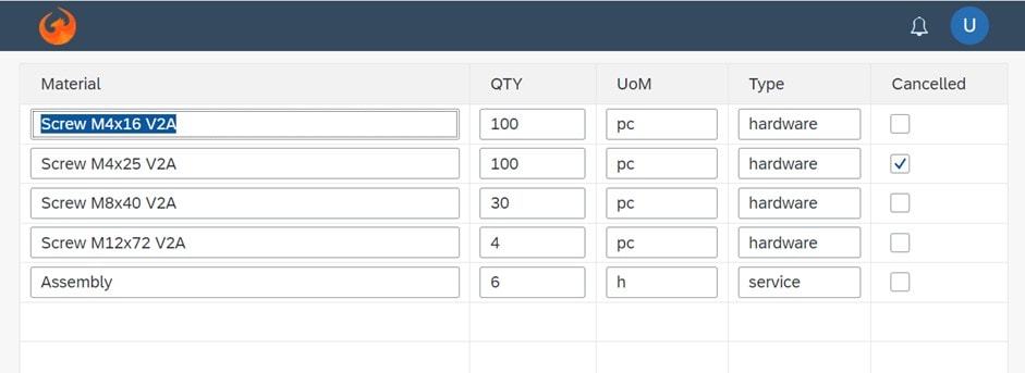
Because our sales team rarely uses these options and enters the data while working remotely, a much simpler screen is required. The only fields this app requires are: Material ordered, quantity, and if the line item is cancelled. As it is important for this company to balance between fees, hardware and software costs, this information must be present as well.
The initial application translates the requirements literally. This is something every no-code tool supports.
Control types
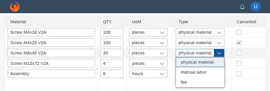
The first enhancement will be to change the input controls UoM and Type to selectors. The user should not be typing but instead selecting the correct setting from a short list of possible values with a nicer text.
For the material, such a selector does not make sense, as its list would be 30,000 items long. Typing is much faster, and a suggestion list should be shown while typing.
That is the first important lesson: Although in all three cases the requirement is the same – select an item from a list – different control types must be used. Suited controls SAP Fiori provides are:
- A Select for a small number without the option to type the name, just navigate to the item and select it. Pros: little space requirements, easy to use. Cons: potentially one click to open the list, one click to select the new item, but keyboard navigation also works.
- A List to show all possible options at once. Pros: can deal with many items. Cons: requires a lot of space in the canvas.
- An Input Field for free text entry with suggestion lists. Pros: well-suited for very large lists and requires little space. Cons: user must know what to type or a value help dialog must be provided.
- A Combo Box is a Select with the option to type. Pros: little space, full flexibility. Cons: potentially multiple clicks required.
These should be standard for every tool.
Cancelled lines
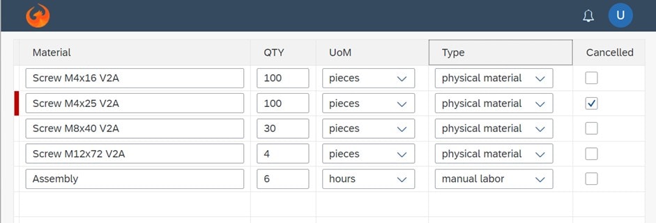
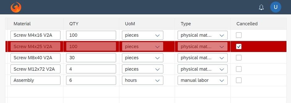
When using this UI, it often happens that the Cancelled checkbox is overlooked. The sales person then cover all three aspects – fees, services and hardware – even though the services were actually cancelled. A case like this requires better highlighting.
The only option the Fiori Table provides here are row settings to render a small color block at the front.
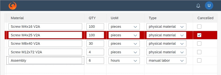
That is much better, but still not visible enough. How about highlighting the entire row in red? Now it would be harder to overlook, wouldn’t it?
Trouble is, the tool I used (SAPUI5 controls) does not support coloring the entire row out of the box. So I had to switch to custom CSS rules and do some coding. Just a few lines, no big deal, but if the no-code tool fails to support such a highlighting feature and does not support adding own extensions, this cannot be solved. Yes, it is a trivial requirement, yes, it requires just a few lines of code – but without coding, it cannot be done.
These kinds of custom extensions are required often and are the source of great frustration whenever the end-user has a good idea – “We could make the entire row red!” – and quickly learns that “it cannot be done” or “it takes eight hours to implement that”. Try to explain that as a developer!
Control settings depend on settings
We can also go one step further and disable the controls of a cancelled order, as the material, quantity and so on must not be changed for cancelled line items.
From a tool perspective, this is a new degree of freedom. A table has many identical rows, but the settings of the controls within one row depend on other settings. Every tool in the market supports that – at least I hope so.
New order (line)
All the UI above is capable of is changing existing order lines, but we must have a way to enter new lines as well. For that, three options come to mind:
- An Add button in the toolbar. Pros: good visual clue. Cons: constant switch from keyboard to mouse (to click on the add button) and back to keyboard, the toolbar requires space in the canvas.
- A context menu. Pros: no additional space needed. Cons: same as with the add button, plus not that obvious to find.
- Do what SAP does. Add an empty line.
In the following screenshot, the table has a title and an Add button in the right top corner. Now imagine the workflow when the user must create 100 lines: click Add, scroll to the bottom, click on the material control, enter all, grab the mouse to click on Add, and so on and so forth. This will likely not be appreciated.
Manipulate the data object
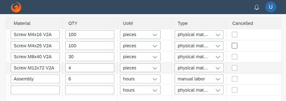
The method applied by SAPGUI and Fiori for new order lines is much better in that regards. The logic is to always have one additional empty line at the bottom. The screenshot below shows that.
But what does that mean, technically speaking? From the backend system, we get a data object with five lines. However, we need to add another empty row with the default values right after the data object is received. When a material in the table is entered, we must add a new row at the bottom as well, but only if no new row exists already. Also, when sending the data object back to the ERP system, the server-side will fail with an error saying that one line does not have a material set. So before sending, this extra line must be removed.
Again, either the tool supports that out of the box (very unlikely) or we need an extension to program this logic through a few lines of code.
Calculations
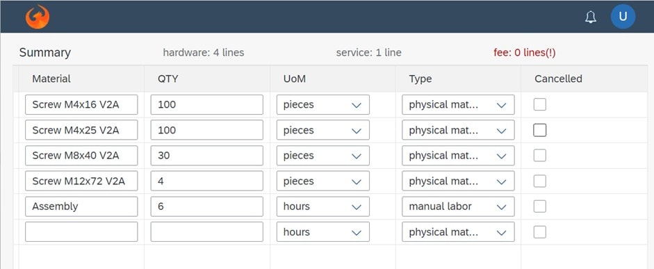
One of the main reasons for a new application often is to ensure the orders entered not only contain the hardware, but the user does not forget services and fees. So, it makes sense to highlight that somewhere, e.g., adding that information in the toolbar.
This shows prominently that this order is lacking line items related to fees. Some controls allow for that, e.g., the Fiori Grid Table allows for grouping the data. But then the table would have intermediate lines and not one summary with the counts.
To implement this requirement, the entered data must constantly be aggregated and counted, and the result updates the table header controls. Again, a brand-new dimension of capabilities are required in the tool – or just a few lines of coding, if the tool allows for that.
Derived information
The UoM and Type columns have an issue: They depend on the chosen material. When Assembly is selected by the user as material, the UoM is either hours or a fixed price package, and the Type is for sure a service. This information must be shown on the screen. The least we should do is to set their values after a material has been chosen.
In technical terms, the suggestion list of the material contains hidden information about the default UoM and the Type. When the user picks one, this hidden data are copied into the other controls – except if they are not empty. We do not want to default to “hours” just because the user switched from “Assembly 1” to “Assembly 2”.
Requirements of the backend
The backend imposes a couple more requirements on use that impact the UI:
- A sales order line that has been saved in the ERP before cannot be deleted. It can be cancelled.
- A line that has not been sent to the backend can be deleted – no need to send a brand-new order line with the flag cancelled.
- Certain combinations of values are not allowed, e.g., you can order a hundred pieces of screws, but not a hundred hours of screws.
For the first two points, another property for the origin of the data is required: server-vs-user must be stored, and it needs to allow different operations. Furthermore, the validation logic has to be executed after each change to show – or better prevent – illegal combinations of data.
Summary
In the end, the big question is if a citizen developer can build such an application with the tool of choice. If the answer is yes and it is a no-code tool that supports all of that out of the box, that would be impressive. However, then other cases wouldn’t be supported.
If the tool allows for code extensions in such a way that the citizen developer and the IT department can work on the solution in parallel, then this is the optimal solution. Both can work on the overall solution focusing on their unique area of expertise. Unfortunately, this is the exception. Usually, the app developer builds the first or second variant and all further refinements must be done by the IT team. If you use the no-code tool to make a modification, all manual coding is lost.


![low code no code sap fiori [shutterstock: 237488095, Alex from the Rock]](https://e3zine.com/wp-content/uploads/2022/05/low-code-no-code-sap-fiori-shutterstock_237488095.jpg)





Thanks for posting this.
It makes me think of vehicle manufacturing where we have an options list. If we find what we want in the options list, we are happy. If we can’t, we must take the vehicle to a custom shop to have it modified at considerable expense (or worse, pay for an entirely custom vehicle to be built). Consider also the ongoing maintenance cost of such customization. If there is a compelling reason to do this, then the money may be well spent.
Thankfully, modern no-code development permits the inclusion of plugins, sold via online marketplaces or built in-house by large corporations. These plugins are typically coded, and can thereby provide intricate functionality.
Another limitation of this architecture relates to performance. Where millions of users are involved, latency may become a problem. For this reason, many no-code solutions are used for prototyping and MVP construction. In spite of this, the balance (transition) point is changing, in the sense that the reach of these applications is ever growing. Time will tell how far they grow.
In the case of low-code development, small amounts of code can be inserted where there is provision to do so. Performance is less of a concern here, but likewise low-code solutions often support the aforementioned plugin architecture, to which the same performance concerns apply.
“If you use the no-code tool to make a modification, all manual coding is lost.” That comment applies to some older products. Code insertion points and plugins resolve the problem.